

What do you think? Do these two photos answer this Friday’s prompt?
Friendly Friday is hosted by Amanda and Sandy every Friday.
Let’s be social Mix/ Twitter / Facebook / Instagram / Bloglovin’ /

What do you think? Do these two photos answer this Friday’s prompt?
Friendly Friday is hosted by Amanda and Sandy every Friday.
Let’s be social Mix/ Twitter / Facebook / Instagram / Bloglovin’ /

[…] Friendly Friday Photo Challenge: Colour Harmonies my way […]
LikeLike
Yes, they work! Especially that first one. 😊
LikeLiked by 1 person
Thanks
LikeLiked by 1 person
I love your photos and I’m with you, I just photo something I like without thinking about colors and styles. 😄
LikeLiked by 1 person
thanks Sheila
LikeLike
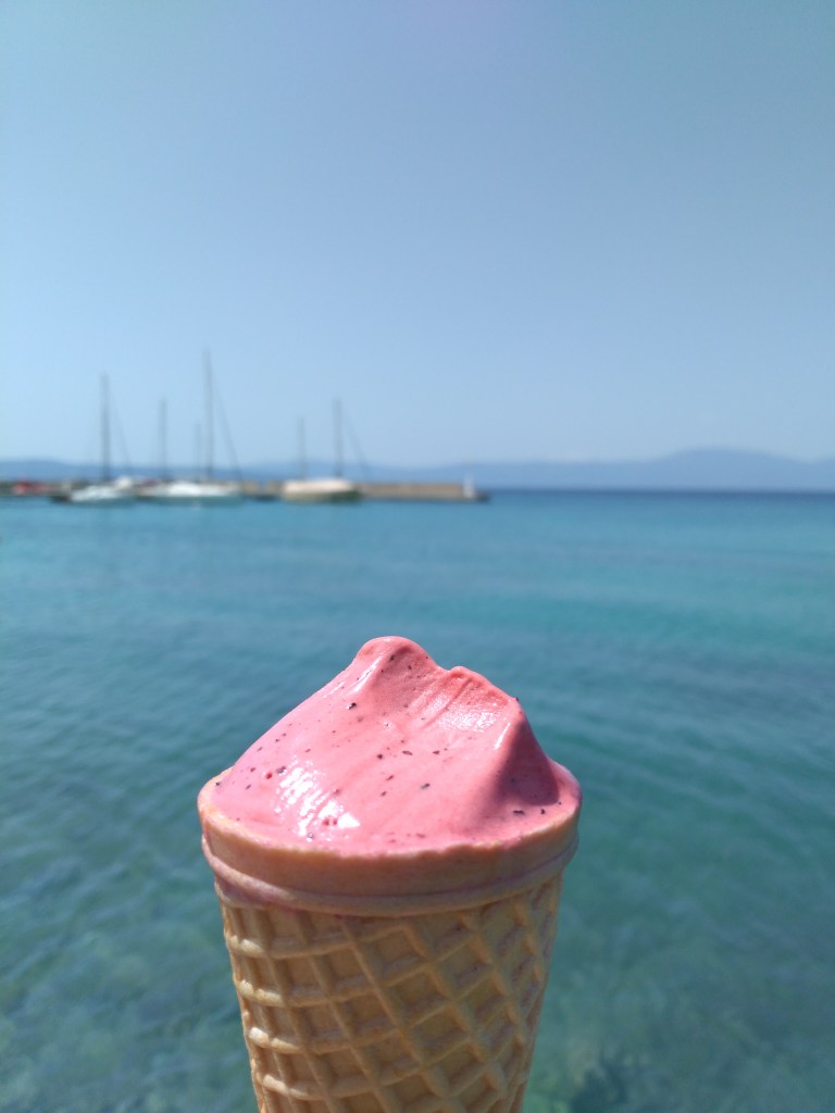
Love the ice cream cone! Perfect!
LikeLiked by 1 person
Thanks
LikeLiked by 1 person
I do think you have met the brief, and met it well! How intense is that pink ice cream against the softer blues in the background?
Whilst the blue sky against the orange tones of the old buildings in Croatia definitely has a complementary harmony to it. The walls and those smaller deeper orange areas under the arches on the building on the right are enhanced by the deep blue of the sky. Perhaps your eye picked up the colour harmonies without realizing it and that is what attracted you to take these shots?
Great work and welcome to Friendly Friday. I hope you have fun participating in the challenges.
LikeLiked by 1 person
Thanks. I thought the first photo was an example of contrasting colors and the second photo also shows the contrast between the blue of the sky and the earthy tones of the houses but there’s also as you have pointed out a complementary harmony of those orange colors of the ground, houses…
LikeLiked by 1 person
Looks harmonious to me!
LikeLiked by 1 person